Luxury interiors are remembered by how they feel, not just how they look. And color is the first thing the human brain reacts to—before furniture, layout, or finishes. Color theory in luxury interior design is the strategic use of hues, tones, contrast, and balance to create spaces that feel refined, intentional, and emotionally rich.
In high-end design, color is never random. Every shade supports mood, flow, and perceived value.
Why Color Theory Matters in Luxury Interiors
Luxury design isn’t about using more color—it’s about using the right color in the right way.
Color theory helps designers:
- Control mood and emotion
- Enhance architectural details
- Create visual harmony across rooms
- Elevate materials like marble, wood, and metal
- Make spaces feel timeless instead of trendy
Poor color choices can make even expensive interiors feel flat or chaotic.
Core Principles of Color Theory (Simplified)
1. Hue, Value, and Saturation
These three basics define how a color behaves in a space.
- Hue: The actual color (blue, beige, green)
- Value: How light or dark it is
- Saturation: How intense or muted it feels
Luxury interiors often favor low to medium saturation with carefully controlled contrast.
Example:
A deep navy (low saturation) feels elegant. A bright royal blue (high saturation) can feel loud.
2. Warm vs. Cool Colors in Luxury Design
| Warm Colors | Cool Colors |
|---|---|
| Beige, taupe, warm gray | Blue-gray, charcoal, soft green |
| Feel inviting and intimate | Feel calm and expansive |
| Ideal for living areas | Ideal for bedrooms & spas |
Luxury tip:
Mix warm and cool tones to avoid flat spaces. A cool gray room feels richer with warm brass or wood accents.
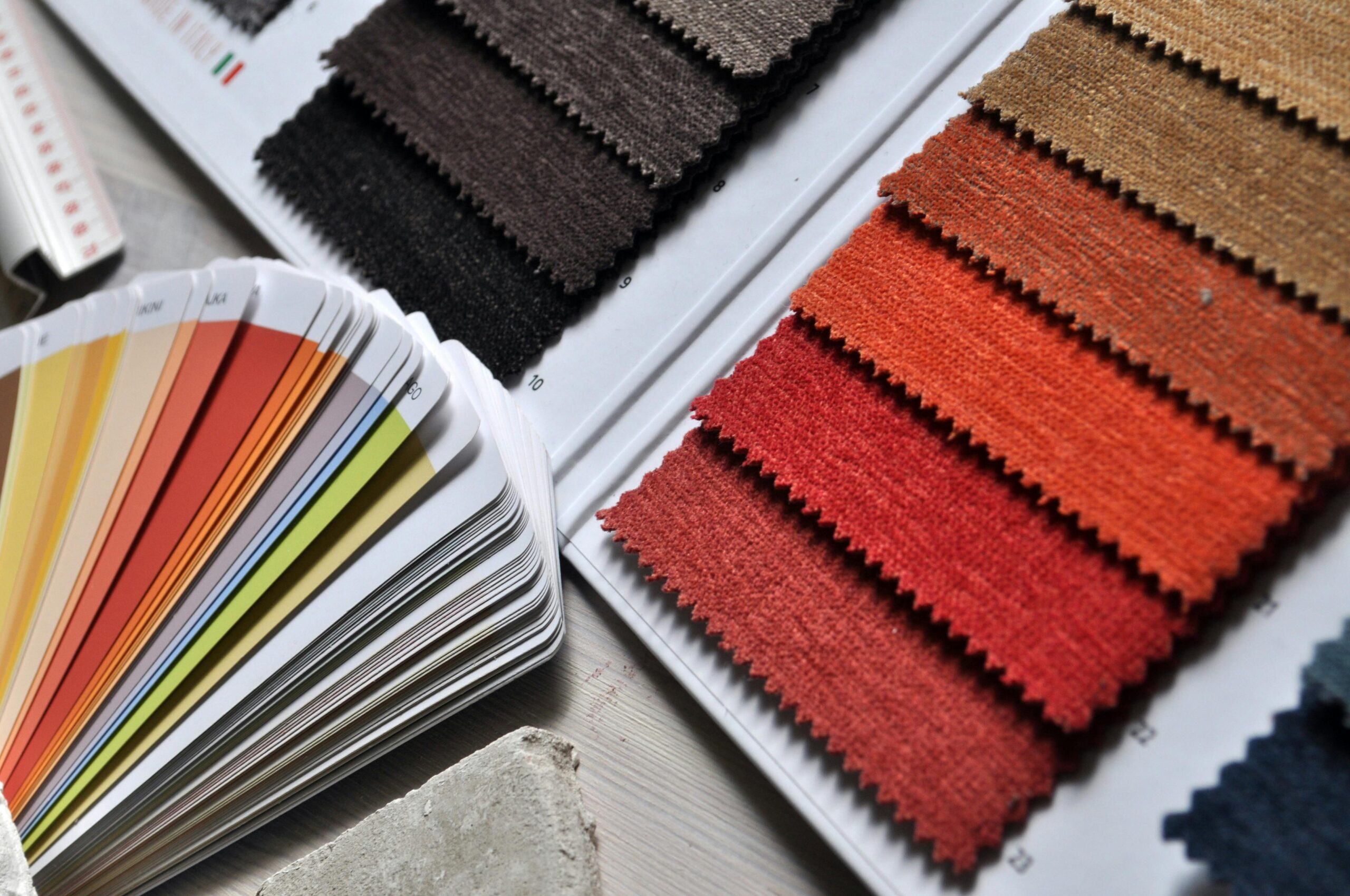
3. Neutral Colors Are the Backbone of Luxury
High-end interiors rely heavily on neutrals—but never boring ones.
Popular luxury neutrals:
- Greige (gray + beige)
- Soft ivory
- Stone
- Mushroom
- Warm charcoal
These shades allow textures, lighting, and finishes to shine.
Real-world example:
Luxury hotels often use layered neutrals with subtle shifts in tone to create depth without visual noise.
Using Accent Colors the Luxury Way
Accent colors in luxury interiors are:
- Controlled
- Intentional
- Used sparingly
Instead of bright pops, luxury spaces favor:
- Emerald
- Burgundy
- Ink blue
- Burnt umber
- Soft gold
Rule of thumb:
Accent colors should appear at least twice in a space to feel intentional.
Color Psychology in Luxury Spaces
| Space | Best Color Direction | Why It Works |
|---|---|---|
| Living Room | Warm neutrals + deep accents | Feels welcoming yet refined |
| Bedroom | Muted cool tones | Encourages rest |
| Bathroom | Soft whites, stone, gray | Clean and spa-like |
| Office | Charcoal, navy, olive | Focus and authority |
Luxury color palettes focus on emotional comfort, not trends.
Pros & Cons of Strategic Color Theory in Luxury Design
| Pros | Cons |
|---|---|
| Enhances perceived value | Requires planning |
| Creates emotional impact | Mistakes are costly |
| Makes spaces timeless | Trend misuse can date design |
| Highlights premium materials | Poor lighting ruins colors |
Real-World Luxury Interior Examples
1: High-End Apartment
- Base: Warm greige walls
- Accents: Dark walnut, matte black
- Result: Modern, calm, expensive feel
2: Luxury Hotel Suite
- Base: Soft ivory walls
- Accents: Navy upholstery, brushed gold
- Result: Comfort + understated elegance
3: Private Villa
- Base: Stone and sand tones
- Accents: Olive green, bronze
- Result: Natural, grounded luxury
FAQs (People Also Ask)
What colors make interiors look more luxurious?
Muted neutrals, deep jewel tones, and warm earth shades make spaces feel high-end. Avoid overly bright or flat colors.
Is white a luxury color?
Yes—when layered correctly. Pure white alone can feel cold. Luxury whites have warmth and texture.
How many colors should a luxury interior use?
Typically 3–5 tones per space. More than that can feel busy.
Are dark colors good for luxury interiors?
Absolutely. Dark colors add depth and drama when balanced with light, texture, and proper lighting.
Should luxury interiors follow color trends?
No. Timeless palettes always outperform trends in luxury design.
Final Verdict
Color theory is the silent language of luxury interior design. It shapes mood, elevates materials, and defines how expensive a space truly feels. When done right, color doesn’t demand attention—it earns it.
Luxury isn’t about bold color choices.
It’s about confident, controlled, and thoughtful ones.
[…] planters that match your interior […]
[…] — and it can be a smart move when done correctly. It’s a cost-effective way to refresh your home’s exterior without full replacement. The key is preparation, using vinyl-safe paint, and sticking to lighter […]