
Flowers can make or break a design. The right color mix feels balanced and natural. The wrong mix feels messy or flat. Color theory in floral design is the practical use of the color wheel to create harmony, contrast, mood, and visual flow in arrangements. When you understand how colors work together, you can design bouquets, centerpieces, and installations that look intentional—not random.
Let’s break it down in simple terms.
What Is Color Theory in Floral Design?
Color theory is a system that explains how colors relate to each other. Floral designers use it to:
- Choose flowers that look balanced together
- Create mood (romantic, bold, calm, dramatic)
- Guide the eye through an arrangement
- Avoid clashing tones
Most designers use the classic color wheel model developed by Isaac Newton. It shows how primary, secondary, and tertiary colors connect.
The Basic Color Groups
Primary colors: Red, blue, yellow
Secondary colors: Orange, green, purple
Tertiary colors: Mix of primary + secondary
In flowers, you see these colors in roses, tulips, hydrangeas, lilies, orchids, and seasonal blooms.
The Most Important Color Schemes in Floral Design
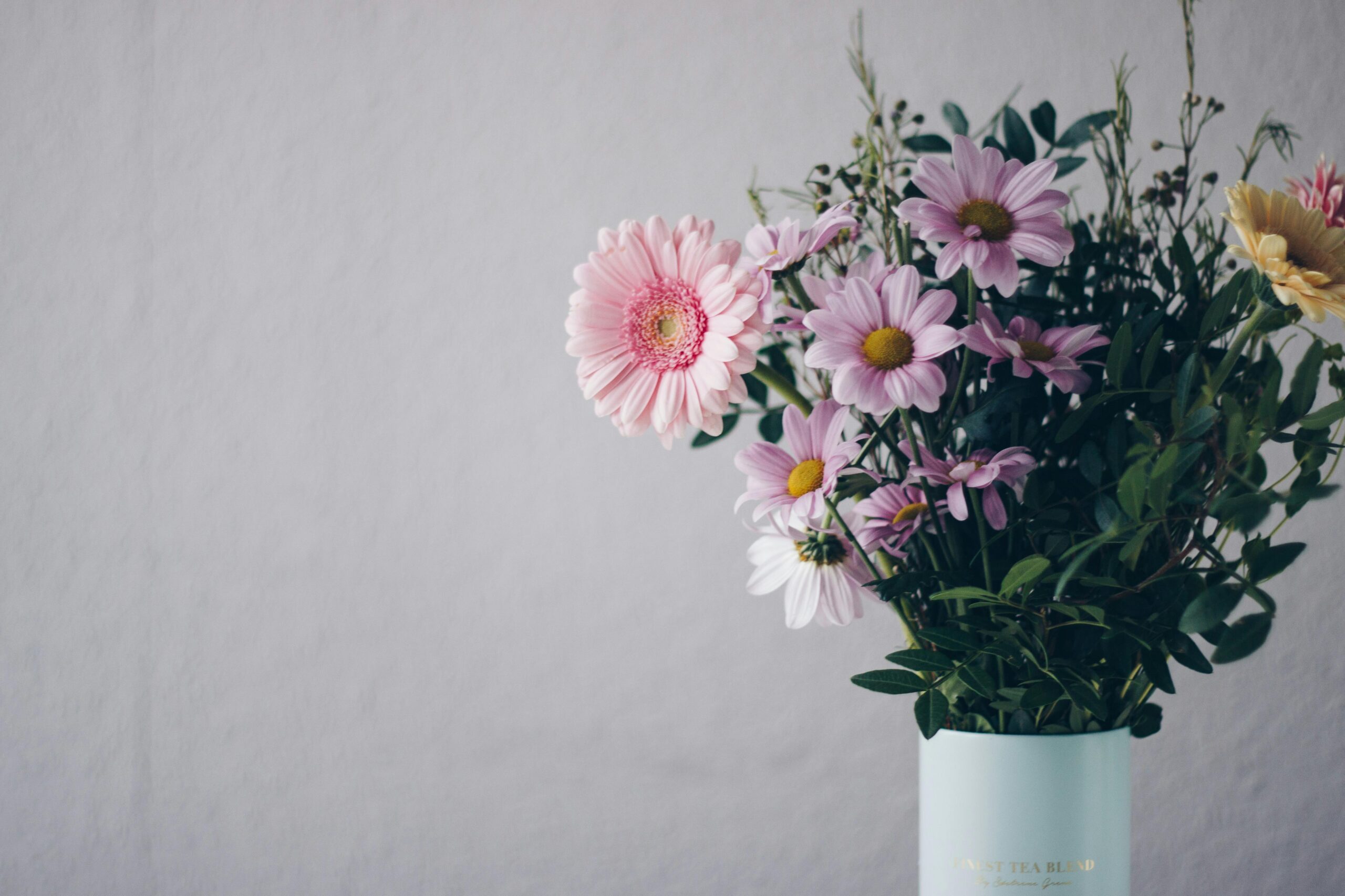
1. Monochromatic (One Color, Many Shades)
This means using different shades and textures of the same color.
Example:
- Light blush roses
- Deep burgundy dahlias
- Soft pink carnations
Why it works:
It looks elegant and cohesive. Perfect for weddings or luxury events.
Best for:
Romantic, modern, minimalist styles.
2. Analogous (Neighboring Colors)
These colors sit next to each other on the wheel.
Example:
- Yellow
- Yellow-orange
- Orange
This feels natural because these colors blend smoothly.
Best for:
Garden-style bouquets and spring designs.
3. Complementary (Opposite Colors)
These colors sit opposite each other on the wheel.
Example:
- Purple and yellow
- Red and green
- Blue and orange
Complementary colors create strong contrast. They make arrangements pop.
Best for:
Bold centerpieces and statement floral installations.
4. Triadic (Three Balanced Colors)
Three evenly spaced colors on the wheel.
Example:
- Red, yellow, blue
- Purple, green, orange
This scheme feels vibrant but balanced.
Best for:
Festive events and creative floral displays.
Warm vs Cool Colors in Floral Design
Color temperature changes the mood of your arrangement.
Warm Colors
Red, orange, yellow
They feel:
- Energetic
- Passionate
- Cheerful
Warm palettes are common in fall weddings and tropical designs.
Cool Colors
Blue, green, purple
They feel:
- Calm
- Elegant
- Fresh
Cool tones work well in corporate events and modern spaces.
How Professional Florists Use Color Psychology
Color affects emotions. Smart floral designers use this to create impact.
- Red = love and intensity
- White = purity and simplicity
- Yellow = happiness
- Purple = luxury
- Green = balance
For example, a romantic wedding bouquet often mixes soft pinks and creams. A luxury hotel lobby might use white orchids and deep greens.
Pros and Cons of Using Strict Color Theory
| Pros | Cons |
|---|---|
| Creates visual harmony | Can feel too predictable |
| Makes designs look professional | Limits creative risk |
| Helps beginners choose flowers | Not all flowers come in perfect shades |
| Works well for event themes | Nature doesn’t always follow theory |
Color theory is a guide—not a rulebook.
Real-World Floral Design Examples
Wedding Bouquet
A bride chooses soft blush, ivory, and sage green.
This is a monochromatic + analogous mix. The result feels romantic and cohesive.
Restaurant Grand Opening
The designer uses orange marigolds and deep blue delphiniums.
This is complementary contrast. It grabs attention from across the room.
Luxury Hotel Lobby
Large white orchids with dark green foliage.
Simple. Minimal. High-end.
Common Color Mistakes in Floral Design
- Using too many bold colors at once
- Ignoring flower undertones (warm pink vs cool pink)
- Forgetting greenery affects the palette
- Mixing clashing reds and purples
Always test flowers together in natural light before finalizing your design.
FAQs – People Also Ask
What is the best color combination for floral arrangements?
There is no single “best” combination. Monochromatic palettes are the safest. Complementary colors create strong impact. The right choice depends on the event mood.
How do I choose flower colors for a wedding?
Start with the venue colors and season. Choose one main color, one support color, and one accent. Keep it simple.
Why do some floral arrangements look messy?
Usually because:
- Too many competing colors
- No dominant shade
- Poor balance between warm and cool tones
Color clarity creates visual order.
Can I break color theory rules in floral design?
Yes. Many modern designers experiment with unexpected mixes. But it helps to understand the rules before breaking them.
Final Verdict
Understanding color theory gives you control.
It helps you design with intention instead of guessing. Whether you use monochromatic elegance or bold complementary contrast, knowing how colors interact makes your floral work look polished and professional.
You don’t need to memorize every rule. Start with simple schemes. Test flowers side by side. Observe how they feel together.
In floral design, color is not decoration. It is structure.
[…] A smart buyer checks performance history — not just discounts. […]